Have you ever spent hours designing something beautiful on your computer—a brightly colored birthday invitation or a vibrant flyer—only to print it out and find the colors look dull, dark, or just plain “wrong”?
It’s incredibly frustrating. But don’t worry, your printer isn’t broken, and your computer screen isn’t lying to you. They are just speaking two totally different languages.
Those languages are called RGB and CMYK.
Understanding the difference is the secret to getting your colors right every time. Let’s break it down simply by looking at where these two systems start before any color is added.
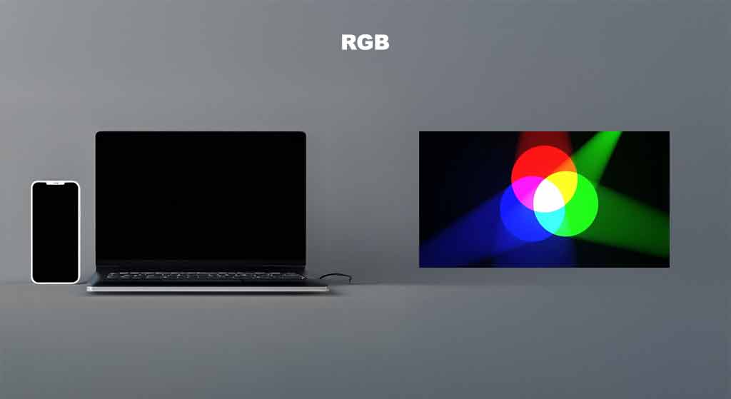
RGB: The Language of Light (Screens)
RGB stands for Red, Green, and Blue.
This is the color mode used by anything that emits light: your phone screen, your computer monitor, and your TV.
Think of your screen as a collection of tiny, colored lightbulbs. To create every color in the rainbow, your screen mixes different amounts of red light, green light, and blue light.
The Starting Point: Darkness
Here is the easiest way to understand RGB:
Think about your computer or mobile screen when it has absolutely no image on it. What color is it? It is black.

In the RGB world, you start with darkness. To get color, you have to add light.
- If you turn on just the Red lights, you get red.
- If you turn on the Red and Green lights together, they blend to create glowing Yellow!
- If you turn on Red, Green, and Blue lights all the way up at full blast, they combine to create bright White light.
Because we are adding light to darkness to create color, RGB is called an “Additive” color mode.
Use RGB for: Anything that will stay on a screen (Websites, social media posts, digital ads).
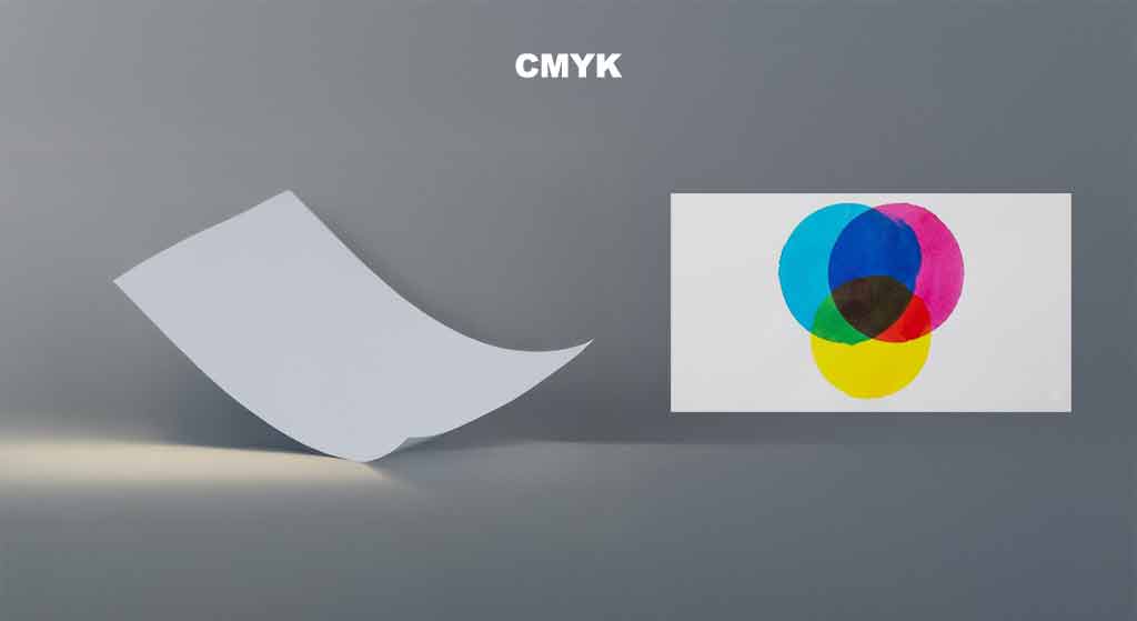
CMYK: The Language of Ink (Printers)
CMYK stands for Cyan, Magenta, Yellow, and Key (Black).
This is the color mode of the physical world: desk printers, giant professional offset presses, magazines, and cereal boxes.
Unlike screens, paper doesn’t emit light. It generally reflects the light already in the room. To create color on paper, we have to use physical inks or toners to cover up the paper.
The Starting Point: The Blank Page
This is where the main difference lies.
Think about your printer tray before you add any ink. What’s sitting in there? Blank white paper.

Use CMYK for: Anything that will be physically printed (Business cards, flyers, brochures, posters).
The Big Summary: Why It Matters
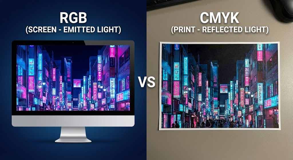
The reason your prints often look different than your screen is that printers (CMYK/Ink) simply cannot create as many bright, neon colors as your screen (RGB/Light) can. You can’t print light!
If you design something in RGB with glowing neon greens and electric blues, the printer will do its best to match it using CMYK inks, but the result will usually look duller.
Here is a simple cheat sheet to remember the difference:
| Feature | RGB (Red, Green, Blue) | CMYK (Cyan, Magenta, Yellow, Black) |
| What it is: | Light | Ink/Toner |
| Where it lives: | Screens, Phones, TVs. | Paper, Cardboard, Fabric. |
| Starting State: | Black Darkness. (We add light to get white or colours). | White Paper. (We add ink to cover the white). |
| Best Used For: | Digital & Web. | Physical Printing. |
Export to Sheets
The Takeaway: Before you start designing, ask yourself: “Will this end up on a screen or on paper?” If it’s paper, set your design software to CMYK mode first to avoid colorful disappointments later!

Bonus Tip: How This Affects Your Brand Color
This isn’t just about printing photos; it’s a huge deal when choosing your brand’s main color. Consistency is key to a strong brand. If you fall in love with an electric, neon blue that only exists in RGB, your logo will look amazing on your website but dull and lifeless on your business cards, signage, and packaging. When picking a brand color, always test how it translates to CMYK to ensure your brand looks professional and recognizable everywhere, not just on a screen. A great designer will always provide you with specific color codes for both RGB (web) and CMYK (print) to keep your brand looking its best across all media.
